RSO Workplace App refresh proposal · prepared by RAY

RSO Workplace app · iOS & Android

Your app, in RSO green.

A refreshed look for the RSO Workplace app, built from your own brand: the green from rsoworkplace.com, your workspace photography and your tagline. Same app, same services, now unmistakably RSO.

Compare before and after

Before & after

Today’s app next to the new look

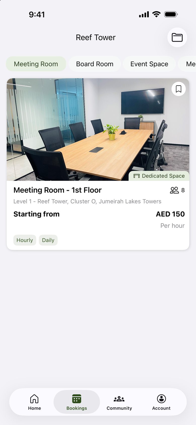
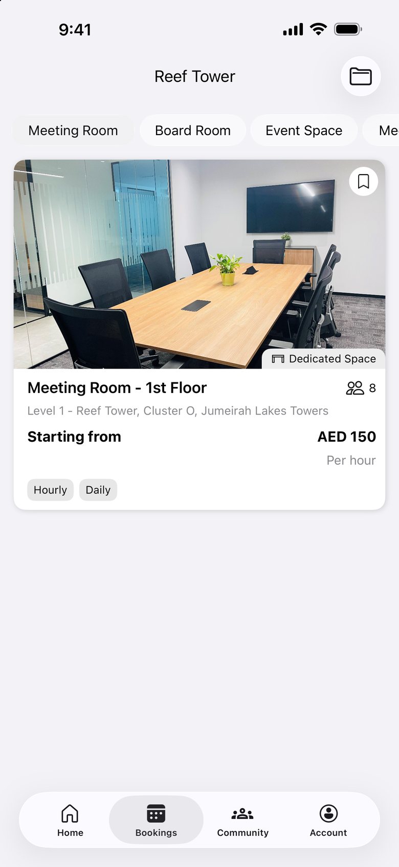
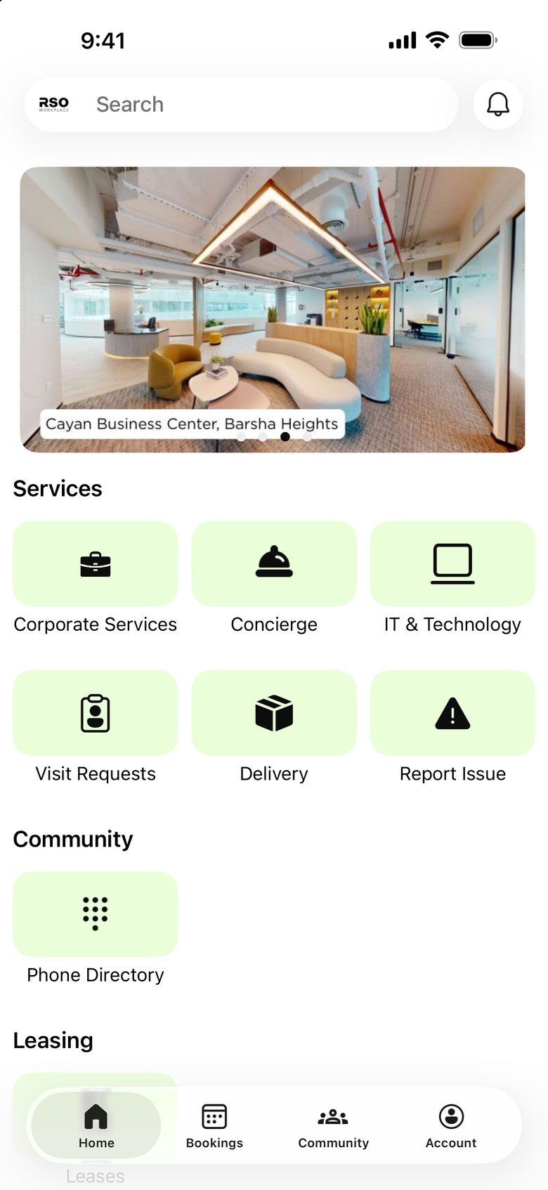
Real screens from the RSO Workplace app with your live content. Drag across each phone to compare.

New design: Welcome screen Current app: Welcome screen

Welcome

The first thing members see

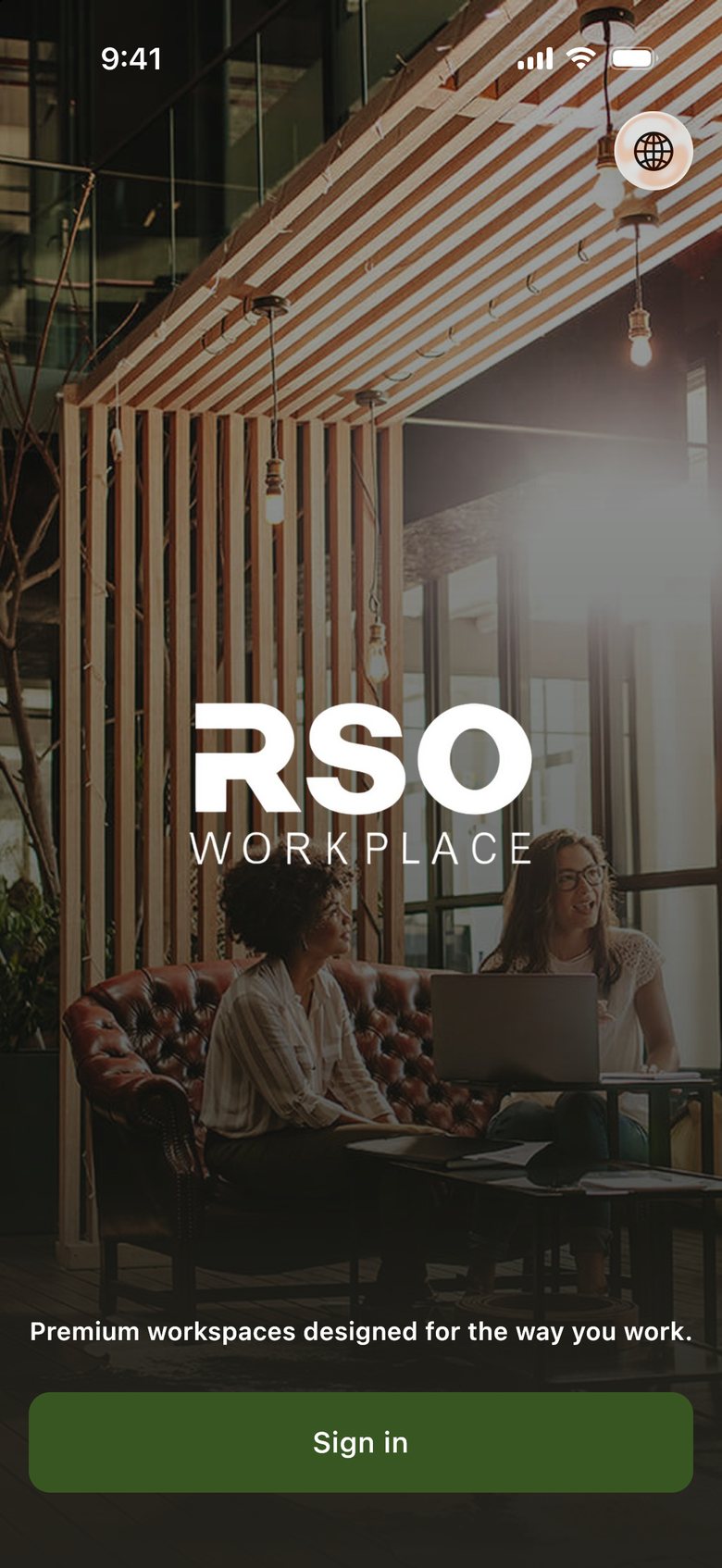
  • Your own workspace photography instead of a blank white page
  • Your tagline, “Premium workspaces designed for the way you work.”, under the logo
  • Sign in button in RSO green, the colour of Book Now on rsoworkplace.com

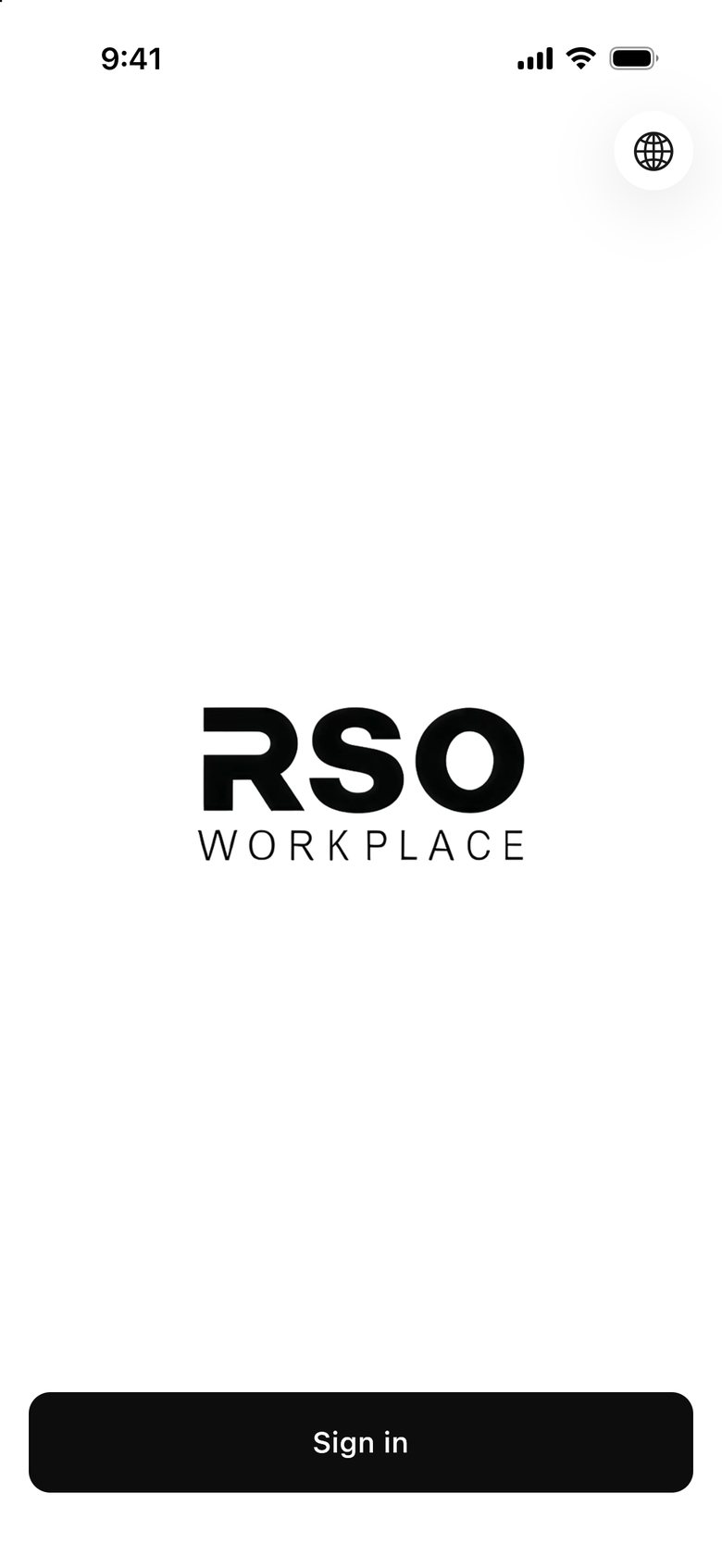
Today the white splash stays white in dark mode and the Sign in button fades into it. The new design keeps the photo and gives the button a lighter green that reads on a dark phone.

Drag the handle to compare today’s app with the new design.
What changes

Six changes, one brand

1

RSO green throughout

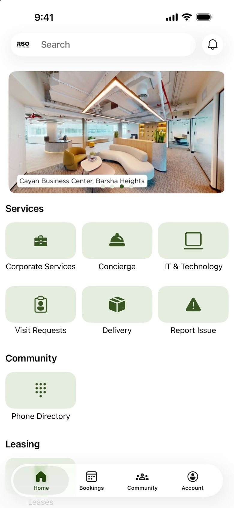
The dark olive green from your website’s Book Now buttons becomes the app’s main colour: buttons, tabs, chips and icons.

2

Your spaces, up front

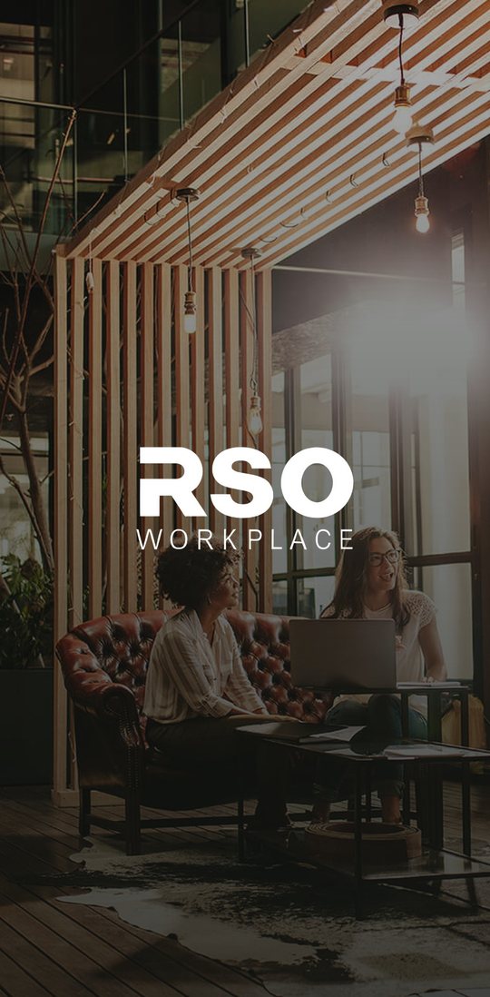
The welcome and launch screens use your own coworking photography instead of a plain white page.

3

Your tagline

“Premium workspaces designed for the way you work.” greets members in English and Arabic.

4

Branded service tiles

Home screen icons sit on soft green tiles, so every service reads as part of RSO.

5

A new app icon

White RSO WORKPLACE wordmark on RSO green, so the app stands out on members’ phones.

6

A proper dark mode

A tuned set of greens for dark mode, so the app stays on brand and readable at night.

Brand kit

The pieces behind the new look

App icon

Current app icon
Today
New iOS app icon
iPhone
New Android app icon
Android

Launch screen

Current launch screen
Today
New launch screen
New

Colour palette

RoleLight modeDark mode
PrimaryButtons, selected tabs, highlights
#385723
#A7ED78
On primaryText on primary buttons
#FFFFFF
#000000
ContainerChips, tiles and soft highlights
#E4EDDE
#24331A
On containerText and icons on containers
#2B3E1D
#EAF0E5

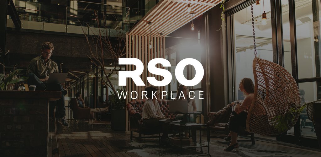
Google Play feature graphic

RSO Workplace feature graphic for Google Play

The banner shown at the top of the app’s Google Play listing.

Delivery

What’s included and what happens next

Included for iOS and Android

  • App iconiPhone and Android (adaptive)
  • LogoLight and dark versions, vector
  • Launch and welcome screensYour photography
  • Colour paletteLight and dark mode
  • Welcome taglineEnglish and Arabic
  • Google Play feature graphic1024 × 500

Next steps

  1. Share your feedbackTell us what you’d like to adjust: the shade of green, the photo or the tagline.
  2. Send your brand filesAn SVG of the RSO WORKPLACE logo and any preferred photography will make the final artwork crisper.
  3. We ship the updateThe new look goes out as an app update on the App Store and Google Play. Members keep their accounts, bookings and content.